


That sounds kind of dull, doesn't it?
But it really, really wasn't!
This book genuinely is a lot of fun to read, packed full of fascinating anecdotes about the history of typography from the 15th century Gutenberg press, to the digital modern day.
It covers beautiful fonts - powerful fonts - lost fonts - functional fonts - ugly fonts - and has a whole chapter devoted to the font everybody loves to hate, poor old

It explains why the quick, brown fox jumped over the lazy dog, and even directs you to a youtube video of the actual event
And it will leave you thoroughly font obsessed, I can promise that you'll never look at a road sign, product packaging, or newspaper masthead in quite the same way again
In short, I can thoroughly recommend this book, it's a cracking good read.
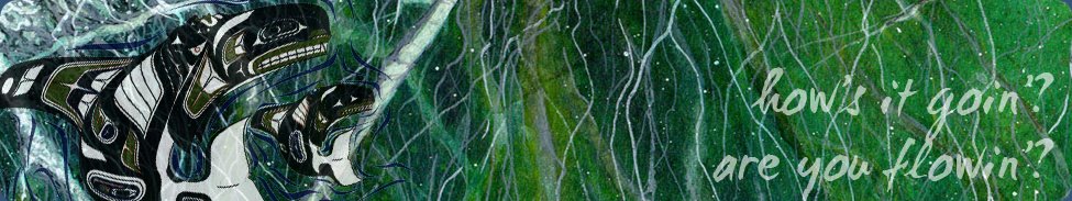
One of my favourite chapters in the book, and the part that has inspired my art page for this month, starts with these ominous words:
Good type never dies, but there is one notable exception - Doves, the type that drowned.
It tells the story of the traditional typeface 'Doves', designed in 1900 by T.J. Cobden Sanderson, who was "a real aesthete. He thought he could invent the perfect, most beautiful type" . It is seen in action below on a page from the Doves Bible.

Sanderson formed a publishing house that printed using Doves type, but after a major falling out, Sanderson decided that he did not want his business partner to be able to use the font after he died. So he took all the cast metal letterforms that had ever been made using the Doves typeface, and he took them to Westminster Bridge and threw them into the Thames.
This took him five months, and over a hundred separate trips to the river with his heavy bags of type, a considerable undertaking for a seventy-six year old man .... he must have REALLY been in a bad mood with his partner.
"Doves was never recovered, at least not the full alphabet. Even now it seems likely that the disintegrating typeface is stuck firm in the riverbed, resisting both dredging and the digital age, perhaps occasionally breaking free to form its own words and sentences as fortune and the molten tide allows"

My page this month is watercoloured, with black pitt pens used for the details.
And, just for this month, here's a bonus bit of digital art - in one of the final chapters of the book, the author lists a few typographical games and apps - one of which is an iPad app called 'TypeDrawing' which looked a lot of fun, so I downloaded it.
Here's my very rough attempt at a portrait of Death (from Neil Gaiman's Sandman comics), rendered in a combination of Zapfino and Verdana-Bold. The text is one of her quotes from the comic: "For some folks death is release, and for others death is an abomination, a terrible thing. But in the end, I'm there for all of them."

This took under 5 minutes and was a breeze - I think I'll be playing around with this app quite a lot!
Next month I'll be reading 'Selling Hitler' by Robert Harris; until then, TTFN


12 comments:
Oh the boring sounding book turned out to be really interesting I think I'm obsessed and haven't read it yet! The weight watcher magazine has a gorgeous font in it at the moment which I love. I have been known to get obsessed over fonts, I did that a couple of years ago with a particular font Shimelle was using on journal your Christmas! I love both pieces of art and can I say - 5 minutes - really? Amazing stuff Sarah
I love fonts. I think they can make and break a book. Love, love, love your Death. I do adore everything written by Neil Gaiman. You know, I have not cared much for iPads in the past, but for this TypeDrawing application, I might get myself one lOl
I love the sound of that book...it's just the sort of thing I used to get sidetracked by when I was supposed to be studying in the Uni library. I shall be adding it to my wish list.
How sad about "Dove" drowning and how well you've captured it in your artwork.
And as for Death....wow! Fabulous picture and an awesome app!
Hugs xx
I HAVE TO start with your wonderful artwork - combining two of my favourite things, drawing and typeface. I have no idea how it can work, but your drawing is amazing, and as an apaholic I shall be making a beeline for the App Store. It seems an ideal way to represent the book, but your painting of the type letters floating down into the obscurity of the river bottom is inspired - he certainly didn't do things by halves. I think this is just about the best piece of book-inspired artwork I have seen in any of the reviews all year, marvellous as those have been.
And yes, I did enjoy the book, because I enjoy the actual font that is used for anything printed as much as what is said - there is even a charm in the uneven type of a very old typewriter. I've stayed reading this and looking at the artworks for ages, and in the meanwhile I've also been to the App Store and bought the App. Can't wait to use it - thanks for sharing it.
What an interesting review (I, of course, have not read my copy as promised!), I'm really looking forward to reading it for myself.
Super artwork to accompany your review, I love the image of those poor Doves letters falling into the river.
The app looks fun :)
xx
Such a wonderful review and super artwork. I just love the printing blocks being tipped in the water. Your digital piece is so effective, so many possibilities. I wish I had an Ipad! What an exciting App. Shall put this book on my list.
Janet xx
I love fonts, this would be right up my alley. I am the saddo that takes photos of names and signs and house names that have nice fonts lol
Love your artwork, the digi one is fabulous. I would like to see that done by hand aswell.
Wow, I love your art! :) I don't understand the hate for Comic Sans. I find it pretty. :)
So late getting round to look this month, my daughters wedding in three weeks time is to blame I am afraid, Your review is so interesting and inspired a super piece of art work, love the colours and those drowning letters. Thank you
Jen x
This sounds such an intriguing book, especially if you are remotely interested in fonts (I am!) On to the wishlist it's going .I love both your art works - am going to see if I can get that app on Android.
Love it all :D
This really is great artwork. The book is something I think I'd enjoy.
I totally got away from the Artful Reader's Club. I don't know where it happened, but I just lost the time of reading and everything and then ... woooosh! Gone!
I tried this app! I made art from a photo of one of our kitties. Of course. I will keep an eye out for this book, too. I love the story of the man throwing his fonts over the bridge. LOLS! That sounds about right. In other news, Canucks nil, Flames nil, but there's been a pile of fights already!
Post a Comment